You Always Remember Your First… Single Issue
The idea of firsts has been on my mind a lot this week; first year at a job, first born kids, first movies… you get the idea. One of these firsts that have been on my mind is the first comic that I ever bought as a serious reader: (Adjectiveless) X-Men #10.
Based on the cover date for this issue, I would have been eleven years old when I purchased this book. Some of my friends today would argue that this book was the beginning of the end, and others would suggest that this was the start of something wonderful. To me, X-Men #10 symbolizes that I’ve been choosing to buy comics over groceries for sixteen years. Since the day that I picked this issue up off the shelf, I’ve read many good books, and some bad books. I like to think that I’ve seen more good then bad, but I’m pretty sure that it’ll be proven as I read more of my back issues that I’m wearing rose colored glasses when it comes to thinking about my comic buying past.
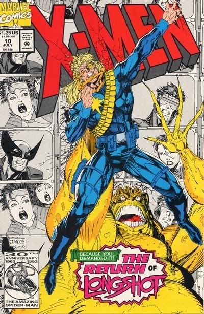 Looking at the cover to this issue today, I can’t help but feel that the picture looks really flat. This is really striking to me as the cover image, with its use of overlapping and interaction with the title art, is actually actively trying to make you feel a sense of depth. Maybe the image isn’t working because of the limited color palette of this period, the printing process, or maybe it something not having to do with the printing at all, but instead the lack of shadow in the art. Whatever the reason is, to me this cover fails. If I saw this cover on the shelf today, I would easily skip over it.
Opening the book, I’m not really surprised to the see the creative team listed as ‘A Jim Lee Joint, with a supporting cast of Scott Lobdell and Scott Williams’. What I wonder is, if this means that Jim Lee plotted this issue and Lobdell scripted, or they are giving Lee more credit as this was the period, where the artist is what sold books. Further in the book there is a retailer ad, offering WildC.A.T.S. #1 for mail order. This is significant as it clearly indicates Image comics was publishing at this point, and suggests that this is likely one of the last works by Jim Lee for Marvel. In general the whole issues art is not up to the standards I have grown to expect from 1990’s Jim Lee. Maybe my problem with the cover, and this issue is the result of the artist ‘phoning it in’ while he is on his way to create comic history with Image.
Flipping through this book, I’m struck by the textual feel of the page. Sure it’s simple newsprint, it doesn’t hold color well, and in fact the paper stock probably unintentionally takes away from the art and will biodegrade in a hundred years time, but to me this is what a comic should feel like. A comic page should not feel slick. Despite the nostalgic kick the paper gives me, its doesn’t do anything to help me remember this story in any positive light.
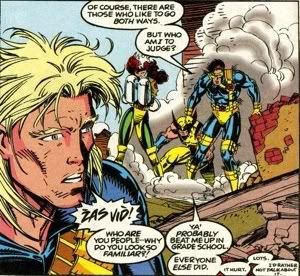
When I first read this story I remember finding it hard to follow. The focus on Longshot and Dazzler, two character I had no knowledge of, really hurt my appreciation of the story. Reading it again, it still hurts the story, but not as much as the actual framing device does. The story starts in media res, our heroes in some twisted version of Wizard of Oz, then cuts to Mojo talking about our heroes trapped in his television show, then from there cuts to a (poorly done) extended flashback sequence which explains how our heroes go stuck on Mojoworld, then it jumps back to… you get the idea. For an 18 page story, there at a lot of scene jumps. There is a lot of arguments today about decompressed story telling in comics, but this book is an example of over compressed story telling. What I can applauded about this issue is its attempt to try and explain a lot of the characters background and powers by the dialogue they use in the story. While probably annoying for the long time reader, it does do a lot to make the story accessible.
The other reason that I may had trouble following this story was because it feature Mojo as the antagonist. I’ve yet to read a Mojo story that I didn’t find confusing or hard to follow, which is a shame as the concept of Mojo is great. A character that uses heroes and their adventures to drive ratings of his inter-dimensional television network? Genius. With the role that reality TV has in our lives, and in general TV, branding, and mass media, Mojo can be a character that could be used to comment and create many interesting stories about today’s society. I salivate at the idea of how this concept could be handled in the hands of a writer like Joe Casey.
So what made me buy the next issue of this title? Some of it is likely ignorance that I was reading a bad book, and some of it was the fact that X-Men was the ‘cool’ book. X-Men fever was going around because of the cartoon, trading cards and recent launch of the second series. Like people who try to explain the appeal of disco with the the answer of “you really had to be there”, you really had to be in the shops at this time period to understand why such a bad book could have appealed so much. This was my first X-Men book, and I would continue to buy the title for the next 60 or so issues.
You may not like your first, but you’ll never forget it. Or in this case, you may not like your first, but you’ll stick around for sixteen years because you liked your second.
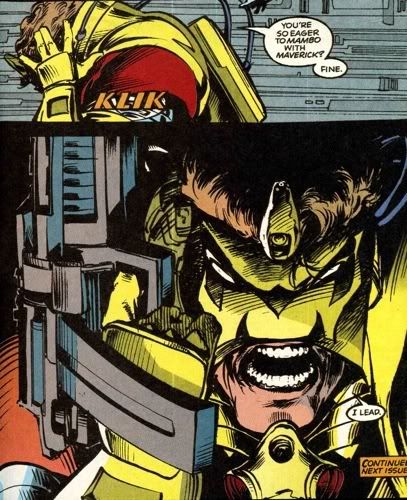
As a bonus, for your amusement, here are a couple of elements from the issue that I found unintentionally funny: